
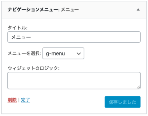
WordPressテーマのSnow Monkeyで、ウィジェットパーツ「ナビゲーションメニュー」にて、子階層があるメニューを設定した場合、折りたたまれて、マウスを近づけると、プラスマークが表示されるオシャレな仕様です。
↓ ウィジェットのコレ
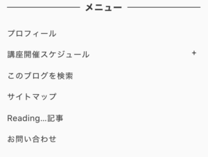
ただ、この折りたたまれていることに気づいてもらいにくいように、感じます。(個人的な意見です)
↓ 右のプラスマークが、目立たないので、気付いてもらいにくい気が、、
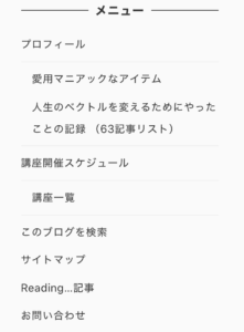
そこで、スタイルシートで、折りたたみを解除して、常時 子階層のメニューも表示するようにしました。
こちらのスタイルシートを、外観 > カスタマイズ > 追加CSS に追加します。
/* ナビゲーションメニュー 子階層も常時表示 */
ul.menu .sub-menu {
    display: block;
}
ul.menu .sub-menu li{
margin-left:1em;
}
button.children-expander {
    display: none;
}
↓ CSSを適用すると、このように表示が切り替わります。